python做可视化
matplotlib
Author

胡林辉

Published

December 23, 2024

1 Heatmap

1.1 Example 1 - Placing Colorbars

In this notebook, we use the reference-location option to indicate that we would like footnotes to be placed in the right margin.

We also use the column: screen-inset cell option to indicate we would like our figure to occupy the full width of the screen, with a small inset.

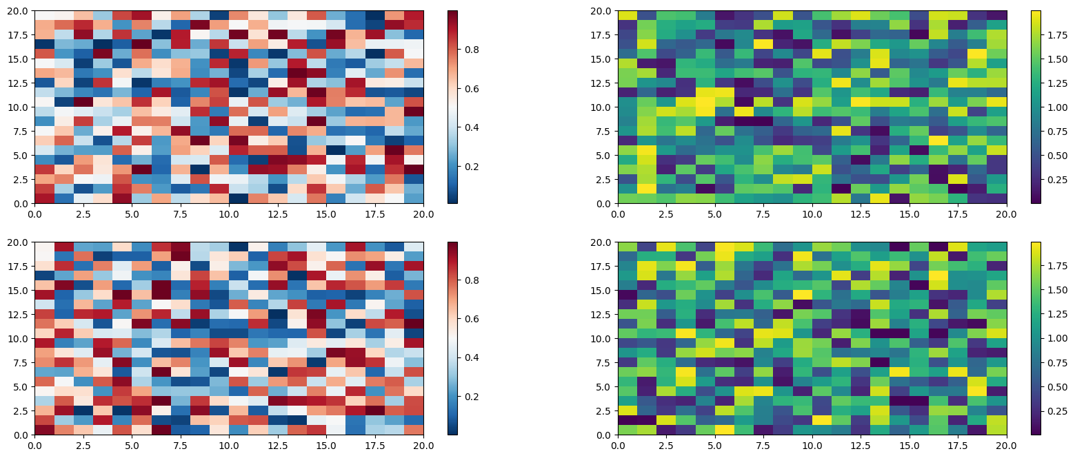
Colorbars indicate the quantitative extent of image data. Placing in a figure is non-trivial because room needs to be made for them. The simplest case is just attaching a colorbar to each axes:1.

1 See the Matplotlib Gallery to explore colorbars further

Code
import matplotlib.pyplot as plt 
import numpy as np
fig, axs = plt.subplots(2, 2) 
fig.set_size_inches(20, 8) 
cmaps = ['RdBu_r', 'viridis'] 
for col in range(2):
    for row in range(2):
        ax = axs[row,col]
        pcm = ax.pcolormesh(np.random.random((20, 20)) * (col + 1),
        cmap=cmaps [col])
        fig.colorbar(pcm,ax=ax)
plt.show()

2 Polar histogram

2.1 Example 1 - Boilerplate code

2.1.1 Step 1: Preparations

2.1.1.1 Importing libraries

Code
import math
import numpy as np
import pandas as pd

import seaborn as sns
import matplotlib.pyplot as plt

from PIL import Image
from matplotlib.lines import Line2D
from matplotlib.patches import Wedge
from matplotlib.offsetbox import OffsetImage, AnnotationBbox

2.1.1.2 Load data

Code
df = pd.read_csv("data/hapiness_report_2022.csv", index_col=None)
df = df.sort_values("score").reset_index(drop=True)

df.head()

#### Seaborn style settings

Next, I use Seaborn to create a base style by defining the background, text color, and font.

Code
font_family = "PT Mono"
background_color = "#F8F1F1"
text_color = "#040303"

sns.set_style({
    "axes.facecolor": background_color,
    "figure.facecolor": background_color,
    "font.family": font_family,
    "text.color": text_color,
})

#### Global settings

I’m also adding a few global settings to control the general look. The first four define the range, size, and width of the wedges in the histogram.

Code
START_ANGLE = 100 # At what angle to start drawing the first wedge
END_ANGLE = 450 # At what angle to finish drawing the last wedge
SIZE = (END_ANGLE - START_ANGLE) / len(df) # The size of each wedge
PAD = 0.2 * SIZE # The padding between wedges

INNER_PADDING = 2 * df.score.min()
LIMIT = (INNER_PADDING + df.score.max()) * 1.3 # Limit of the axes

2.1.1.3 Boilerplate code

Code
fig, ax = plt.subplots(nrows=1, ncols=1, figsize=(30, 30))
ax.set(xlim=(-LIMIT, LIMIT), ylim=(-LIMIT, LIMIT))

for i, row in df.iterrows():
    bar_length = row.score
    name = row.country
    length = bar_length + INNER_PADDING
    start = 100 + i*SIZE + PAD
    end = 100 + (i+1)*SIZE
    angle = (end + start) / 2

    # Create variables here

    # Add wedge functions here
    

# Add general functions here

plt.axis("off")
plt.tight_layout()
plt.show()

2.1.2 Step 2: Drawing wedges

2.1.2.1 Drawing a wedge

Code
def draw_wedge(ax, start_angle, end_angle, length, bar_length, color):
    ax.add_artist(
        Wedge((0, 0),
            length, start_angle, end_angle,
            color=color, width=bar_length
        )
    )
Code
def color(income_group=""):
    if income_group == "High income":
        return "#468FA8"
    elif income_group == "Lower middle income":
        return "#E5625E"
    elif income_group == "Upper middle income":
        return "#62466B"
    elif income_group == "Low income":
        return "#6B0F1A"
    else:
        return "#909090"
#     return "#000"
Code
def add_text(ax, x, y, country, score, angle):
    if angle < 270:
        text = "{} ({})".format(country, score)
        ax.text(x, y, text, fontsize=13, rotation=angle-180, ha="right", va="center", rotation_mode="anchor")
    else:
        text = "({}) {}".format(score, country)
        ax.text(x, y, text, fontsize=13, rotation=angle, ha="left", va="center", rotation_mode="anchor")
Code
def add_flag(ax, x, y, name, zoom, rotation):
    flag = Image.open("../../data/country-flags/png/{}.png".format(name.lower()))
    flag = flag.rotate(rotation if rotation > 270 else rotation - 180)
    im = OffsetImage(flag, zoom=zoom, interpolation="lanczos", resample=True, visible=True)

    ax.add_artist(AnnotationBbox(
        im, (x, y), frameon=False,
        xycoords="data",
    ))
Code
def add_legend(labels, colors, title):
    lines = [Line2D([], [], marker='o', markersize=24, linewidth=0, color=c) for c in colors]

    plt.legend(
        lines, labels,
        fontsize=18, loc="upper left", alignment="left", borderpad=1.3, edgecolor="#E4C9C9", labelspacing=1,
        facecolor="#F1E4E4", framealpha=1, borderaxespad=1,
        title=title,
        title_fontsize=20,
    )
Code
def draw_reference_line(ax, point, size, padding, fontsize=18):
    draw_wedge(ax, 0, 360, point+padding+size/2, size, background_color)
    ax.text(-0.7, padding + point, point, va="center", rotation=1, fontsize=fontsize)
Code
def get_xy_with_padding(length, angle, padding):
    x = math.cos(math.radians(angle)) * (length + padding)
    y = math.sin(math.radians(angle)) * (length + padding)
    return x, y
Code
fig, ax = plt.subplots(nrows=1, ncols=1, figsize=(30, 30))
ax.set(xlim=(-LIMIT, LIMIT), ylim=(-LIMIT, LIMIT))

for i, row in df.iterrows():
    bar_length = row.score
    length = bar_length + INNER_PADDING
    start = START_ANGLE + i*SIZE + PAD
    end = START_ANGLE + (i+1)*SIZE
    angle = (end + start) / 2
    
    # Add variables here
    flag_zoom = 0.004 * length
    flag_x, flag_y = get_xy_with_padding(length, angle, 8*flag_zoom)
    text_x, text_y = get_xy_with_padding(length, angle, 16*flag_zoom)
    
    # Add functions here
    draw_wedge(ax, start, end, length, bar_length, color(row.income))
    add_flag(ax, flag_x, flag_y, row.country, flag_zoom, angle)
    add_text(ax, text_x, text_y, row.country, bar_length, angle)

ax.text(1-LIMIT, LIMIT-2, "+ main title", fontsize=58)

# Add general functions here
draw_reference_line(ax, 2.0, 0.06, INNER_PADDING)
draw_reference_line(ax, 4.0, 0.06, INNER_PADDING)
draw_reference_line(ax, 6.0, 0.06, INNER_PADDING)
plt.title("World Happiness Report 2022".replace(" ", "\n"), x=0.5, y=0.5, va="center", ha="center", fontsize=64, linespacing=1.5)

add_legend(
    labels=["High income", "Upper middle income", "Lower middle income", "Low income", "Unknown"],
    colors=["#468FA8", "#62466B", "#E5625E", "#6B0F1A", "#909090"],
    title="Income level according to the World Bank\n"
)

plt.axis("off")
plt.tight_layout()
plt.show()